Create PivotTable or PivotChart views in an Access desktop database You can use the PivotTable and PivotChart views...
Create PivotTable or PivotChart views in an Access desktop database
You can use the PivotTable and PivotChart views when you need to either do interactive data analysis or create dynamic, interactive charts. This article explains the steps required to create and customize each view.
What do you want to do?
Learn about PivotTable views
A PivotTable is an interactive table that quickly combines and compares large amounts of data. You can rotate its rows and columns to see different summaries of the source data, and you can display the details for areas of interest. Use a PivotTable when you want to analyze related totals, especially when you have a long list of figures to sum and you want to compare several facts about each figure.
Example PivotTable view
The following illustration shows a query of invoice data in PivotTable view. This view shows only the summarized values.
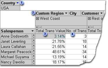
The Country field is filtered to show data only for the United States.
The Custom Region field is a custom group field. Custom group fields allow you to group items the way you want for better data analysis. Here, the City items are grouped into two categories: West Coast and Rest of the Country.
Total Trans Value shows, as a percentage value, the total value of transactions handled by a salesperson in each of the two regions.
No. of Trans shows the number of transactions handled by a salesperson in each of the two regions.
In the preceding illustration, you can easily compare data across different salespeople and regions. Because the table is interactive, you can quickly change the filters, totals, and the level of detail displayed, so you can analyze your data in different ways.
View detail data
You can click the plus sign (+) to the right of a salesperson or below a region to see individual detail records. The following illustration shows detail data for Anne Dodsworth.
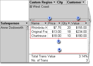
These detail fields exist in the underlying record source.
A calculated detail field uses an expression based on other detail fields.
These individual transactions were handled by Anne Dodsworth in the West Coast region.
Summary fields and data appear at the bottom of the view.
You can click the minus sign (-) to the right of a salesperson or region to hide the corresponding detail data.
Note: Hiding detail data improves the performance of the PivotTable view.
View individual items
When a column area has more than one field, you can click the plus sign (+) or minus sign (-) to the left of an item to show or hide lower-level items. For example, to display summarized or detail data for each city on the West Coast, click the plus sign (+) to the left of West Coast.
The following illustration shows the summarized values for each city in the West Coast group.
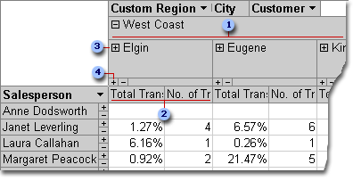
Items of the City field that are grouped under the custom group West Coast.
Summary data for Elgin.
Clicking here displays customers based in Elgin and summary data for each customer.
Clicking here displays detail data for Elgin.
Create a PivotTable view
You can also create PivotTable and PivotChart views for Access queries, tables and forms. For the purposes of this article, we explain how create a PivotTable view and a PivotChart view for an Access query.
Step 1: Create a query
If you do not already have a query that you want to use for your PivotTable view, create a new one:
-
On the Create tab, in the Queries group, click Query Wizard if you want a wizard to help you build your query, or Query Design if you want to build the query yourself.
When adding fields to the query grid, make sure to include:
-
Fields that contain the data you want to summarize (for example, currency amounts or other numeric data).
-
Fields by which you want to compare data, such as employee, region, or date.
If you plan to count items in your PivotTable, you should also include a unique ID field for the items you are counting. For example, to count the number of invoices, your query should include the ID of the invoice table.
For more information about creating queries, see the article Introduction to queries.
Step 2: Open the query in PivotTable view
-
If the query is not already open, in the Navigation Pane, double-click the query.
-
On the Home tab, in the Views group, click View, and then click PivotTable View.
Access displays a blank PivotTable view without any fields or data.
Step 3: Add data fields to the PivotTable view
In this step, you add the fields that make up the row and column headings of the PivotTable view, as well as the detail and filter fields. To do this, the Field List must be visible.
-
If the Field List is not visible, on the Design tab, in the Show/Hide group, click Field List.
Add row fields
Row fields are the ones that make up the rows of the PivotTable. In the illustrations at the beginning of this article, Salesperson is the row field.
To add a row field:
-
Drag the field from the Field List to the area marked Drop Row Fields Here in the PivotTable.
Alternatively, you can add the filter field by using the following procedure:
-
Select the field in the Field List.
-
At the bottom of the Field List, select Row Area from the drop-down list, and then click Add to.
Add column fields
As the name implies, column fields are the ones that make up the columns of the PivotTable. In the illustrations at the beginning of this article, City and CustomerID are column fields.
To add a column field:
-
Drag the field from the Field List to the area marked Drop Column Fields Here in the PivotTable.
Alternatively, you can add the filter field by using the following procedure:
-
Select the field in the Field List.
-
At the bottom of the Field List, select Column Area from the drop-down list, and then click Add to.
Add detail fields
Detail fields are the ones that make up the detail cells of the PivotTable. In the illustrations at the beginning of this article, Product Name, Unit Price, and Quantity fields are all detail fields.
To add a detail field:
-
Drag the field from the Field List to the area marked Drop Totals or Detail Fields Here in the PivotTable.
Alternatively, you can add the filter field by using the following procedure:
-
Select the field in the Field List.
-
At the bottom of the Field List, select Detail Area from the drop-down list, and then click Add to.
Add filter fields
Filter fields are optional. Adding a filter field allows you to filter the entire PivotTable by a value. For example, in the first illustration at the beginning of this article, the Country field has been added as a filter field. As a result, the entire PivotTable can be filtered for specific countries.
To add a filter field:
-
Drag the field from the Field List to the area marked Drop Filter Fields Here in the PivotTable.
Alternatively, you can add the filter field by using the following procedure:
-
Select the field in the Field List.
-
At the bottom of the Field List, select Filter Area from the drop-down list, and then click Add to.
Move a field
-
Drag the field name to the location you want. Make sure to drag the field name itself (for example, Salesperson), and not one of the field values.
Delete a field
-
Select the field name that you want to delete, and then on the Design tab, in the Active Field group, click Remove Field.
Note: This action removes the field from the view, but the field is still available in the underlying data source.
Step 4: Add calculated detail fields and total fields to the view
Add calculated detail fields
-
On the Design tab, in the Tools group, click Formulas, and then click Create Calculated Detail Field.
Access displays a Properties dialog box. -
In the Name box, type a name for the calculated field.
-
In the larger box below the Name box, type the calculation that you want to perform, for example:
UnitPrice * QuantityTip: While you are typing the calculation, you can use the drop-down list and the Insert Reference To button at the bottom of the Properties dialog box to add fields to the calculation.
-
Click Change. Access adds the calculated field to the field list.
-
Repeat steps 2 through 4 for any other calculated fields you want to create.
-
Close the Properties dialog box.
-
Add the calculated field to the PivotTable per the instructions in the section Add detail fields.
Add total fields
-
Make sure detail cells are displayed: select a column heading label, and then on the Design tab, in the Show/Hide group, click Show Details.
-
Select one of the detail values for which you want to add a total.
-
On the Design tab, in the Tools group, click AutoCalc, and then click the type of total you want to add.
-
Repeat step 3 for any other types of totals you want to add.
Step 5: Change field captions and format data
-
In the PivotTable, select the label of the field that you want to change.
-
On the Design tab, in the Tools group, click Properties.
-
In the Properties dialog box, click the Captions tab.
-
In the Caption box, type the caption you want, and then press ENTER.
-
Set any other formatting options that you want for the captions.
-
In the Properties dialog box, click the Format tab.
-
Use the commands on the Format tab to sort data and to format the text and the cells.
-
If your PivotTable contains total rows, click Hide Details on the Design tab to hide the detail fields and show only the total fields.
-
Repeat steps 3 through 7 to set captions and formats for the total fields.
Tip: To show totals as a percentage of a grand total, select one of the totals, and then on the Design tab, in the Tools group, click Show As, and then select which grand total that you want to compare to (row total, column total, and so on.)
Step 6: Filter, sort, and group data
-
To filter data, click the down-arrow next to any field name, and then select or the check boxes to obtain the filtering you want.
-
To group data:
-
In the PivotTable, click the values that you want to group. For example, to group several cities together, click the first city, and then press and hold the CTRL key while you click the other cities you want to group.
-
Right-click one of the selected values, and then click Group Items.
Access creates a custom group level. You can change the caption and formatting of the group by using the procedure in the section Step 5: Change field captions and format data.
-
After you have added a grouping level, you can select the group and then use the Expand Field and Collapse Field commands on the Design tab to view or hide the individual fields in the group, respectively.
Design a PivotChart view
Differences between PivotTable view and PivotChart view
The layout of a PivotChart view is similar to that of a PivotTable view, except that, by default, PivotTable views show data details while PivotChart views show data totals or summaries (usually in the form of sums or counts).
Also, instead of row and column areas, a PivotChart view shows series and category areas. A series is a group of related data points and is usually represented in the legend by a particular color. A category consists of one data point from each series and is usually represented by a label on the category (x) axis.
The layout changes that you make to a table, query, or form in other views are independent of the object's layout in a PivotTable or PivotChart view. However, a layout change that you make in PivotTable view, such as moving a field from the row area to the column area, is reflected in the PivotChart view, and vice versa.
PivotChart view examples
The first PivotChart view example illustrates the five salespeople who had the highest sales amounts (as indicated by total unit prices) in the United States between 1996 and 1998. Each data marker extends to the value on the value (y) axis that represents the sum of prices for units sold.
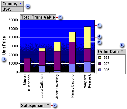
In the filter area, the Country field is filtered to show only USA unit prices.
The data area shows the totals for unit prices sold.
The plot area provides a background for the data markers.
Gridlines make it easier to see where data markers fall on the value axis.
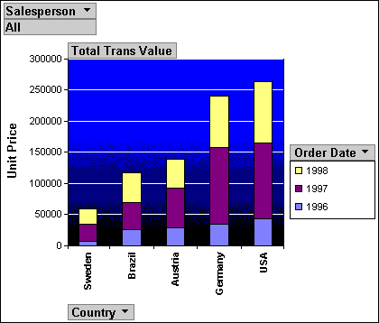
This data marker represents one category point (in this case, a salesperson) made up of three series points (in this case, the years 1996, 1997, and 1998).
The series area contains the series field Order Date. A legend has been added to the right side of this chart and appears directly beneath the series field.
The category area consists of category labels; in this case, the category labels are salespeople's names.
The axis value label provides a frame of reference for each data marker.
The same chart can be "pivoted," or manipulated, to illustrate different sets of analyses, such as in the next example, which compares the top five countries/regions for orders placed. (Note that in this example, the Salesperson field is now in the filter area, while the Country field is in the category area).
Create a PivotChart view
The following instructions are based on the assumption that you have completed the above steps to create a PivotTable view.
Step 1: Switch to PivotChart view
On the Design tab, in the Views group, click View, and then click PivotChart View.
Step 2: Add and remove fields in the PivotChart view
In this step, you can add or remove fields from the chart. When you remove a field from a chart, the data is still available via the field list, but it is not displayed in the chart.
Add a field
-
To add a field, drag it from the Field List to one of the "drop zones" on the chart. Alternatively, you can select the field in the field list, and then at the bottom of the Field List, select the area to which you want to add the field, and then click Add to.
-
If you do not see drop zones, on the Design tab, in the Show/Hide group, click Drop Zones.
-
If you do not see the Field List, on the Design tab, in the Show/Hide group, click Field List.
-
Delete a field
-
To delete a field, select its label on the chart, and then press DELETE. Alternatively, you can drag the field away from the chart.
Step 3: Group, filter, and sort data
To make a chart more readable, it's often a good idea to group, filter, and sort the data. For example, in the illustrations at the beginning of this section, order dates are grouped by years so that it's easy to see summaries for each year at a glance rather than having to look at each individual order date. Also, the data is filtered to see which five salespeople had the highest sales amounts. Finally, each data marker is sorted by its total value in ascending order so it's easy to see which of the five salespeople had highest sales and which had lowest.
Group data
-
Select a field name in the chart.
-
If the Properties dialog box is not already displayed, right-click the field name and then click Properties.
-
In the Properties dialog box, click the Filter and Group tab.
-
Under Grouping, in the Group items by list, select the grouping option that you want. For example, on a date field, you can click Years. On a text field, you can group by prefix characters, for example, the first 3 characters of a name.
Filter data
-
Select a data marker in the chart.
-
If the Properties dialog box is not already displayed, right-click the data marker and then click Properties.
-
On the Filter and Group tab of the Properties dialog box, under Filtering, select the type of filtering and number of items that you want to display. For example, to see the top 5 items, select Top in the Display the list, and then type 5 in the Items box.
Sort data
-
Right-click a data marker in the chart, point to Sort, and then click the sorting option that you want.
Step 4: Change the chart type
-
Right-click a blank area in the chart, and then click Change Chart Type.
-
In Properties dialog box, in the list on the left, select a general chart type.
-
In the list on the right, select the specific type of chart that you want.
Step 5: Add a legend
-
Click a blank area of the chart.
-
On the Design tab, in the Show/Hide group, click Legend.
Step 6: Edit and format text
Axis titles
-
Select the axis title that you want to format.
-
If the Properties dialog box is not already displayed, right-click the title and then click Properties.
-
In the Properties dialog box, click the Format tab, and, in the Caption box, type the text you want to display.
-
Under Text format on the same tab, select the formatting options that you want.
Data labels
-
Click a data label (for example, one of the labels along the category (x) axis.
-
Click the label again to select all of the labels along the axis.
-
If the Properties dialog box is not already displayed, right-click one of the labels and then click Properties.
-
In the Properties dialog box, click the Format tab, and then select the formatting options that you want.
Step 7: Format the plot area
-
Click in the plot area to select it. The plot area is the box that contains the data markers.
-
If the Properties dialog box is not already displayed, right-click the plot area and then click Properties.
-
In the Properties dialog box, click the Border/Fill tab.
-
Select the formatting options that you want for the plot area.
-
Select a gridline in the chart.
-
In the Properties dialog box, click the Line/Marker tab.
-
Select the formatting options that you want for the gridlines.


COMMENTS